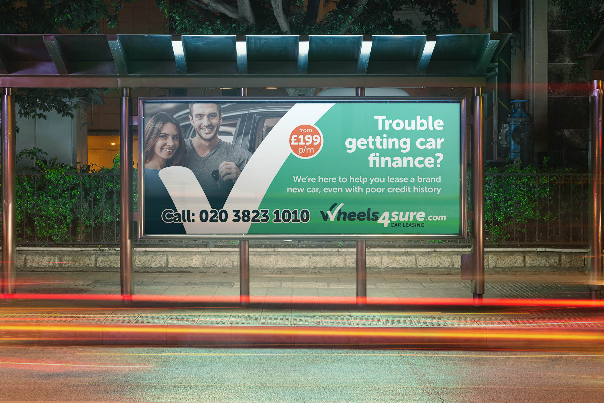
How we helped bring a tired brand up to date

The old branding at Wheels4Sure was looking outdated and tired, and not reflecting the fresh approach to car leasing which was the drive of the business.
After researching the market and competitors, we presented a range of concepts, the strongest being a logotype that combined a green "tick" to indicate positivity and acceptance - their target market was people such as key workers who might have been refused a lease car elsewhere. The font is a soft, rounded typeface, with a subtle italic to give it direction and dynamic. Adding the words "car leasing" also helped to qualify exactly what Wheels4Sure were offering. The new brand colours retained a green hue but in a fresher tone, and introduced a deep blue to compliment the green.
The new branding was then rolled out across stationery, brochure, social media, website, and other media including OOH advertising, vehicle wraps, exhibition banners and shop/forecourt signage.


